Turner Classic Movies — Designing Through Data Loss and System Migration
Company: Warner Bros Discovery
Role: Senior Product Designer
Project Timeline: 2024–2025
Teams: Product, Engineering, Editorial, Brand, Legal
Status: I led design through the first launch phase, focusing on the Schedule as our MVP to validate the new system and design patterns. The same framework is now being applied to additional site sections.
Overview
Turner Classic Movies (TCM) needed to migrate its website to a new internal platform that used a modern design system with strict component guidelines.
At the same time, the site was losing access to a large set of film metadata that powered key features and content. Working with product, we decided our best option to start for this project was the schedule page.
Compounding those challenges, the Schedule page hadn’t been redesigned since the brand’s visual refresh, leaving it inconsistent with TCM’s newer identity and overall design direction.
As the lead designer, I guided how TCM could remain functional, accessible, and visually aligned with the updated brand — all while adapting to new data structures and strict system limitations.
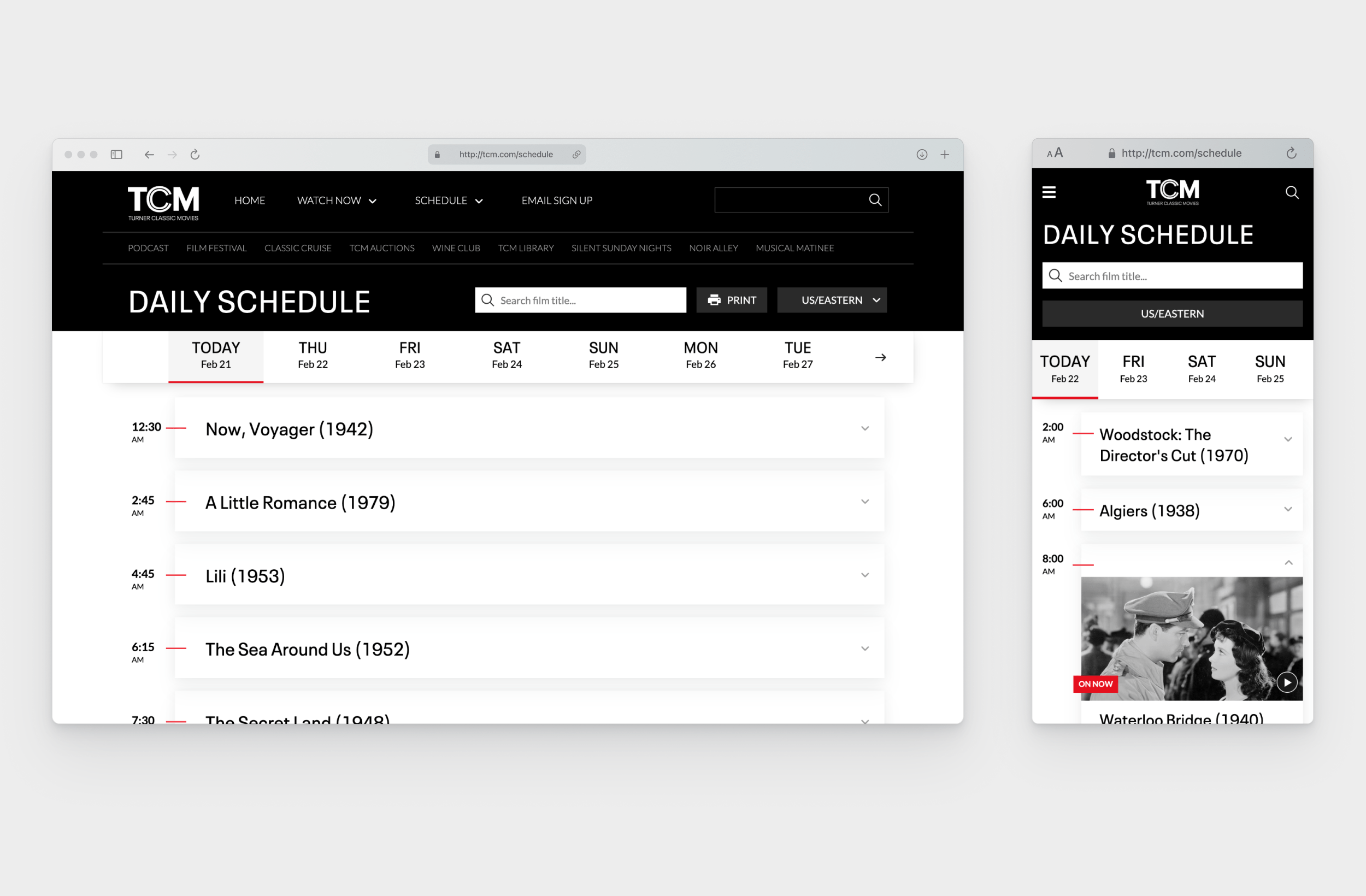
Previous Schedule Page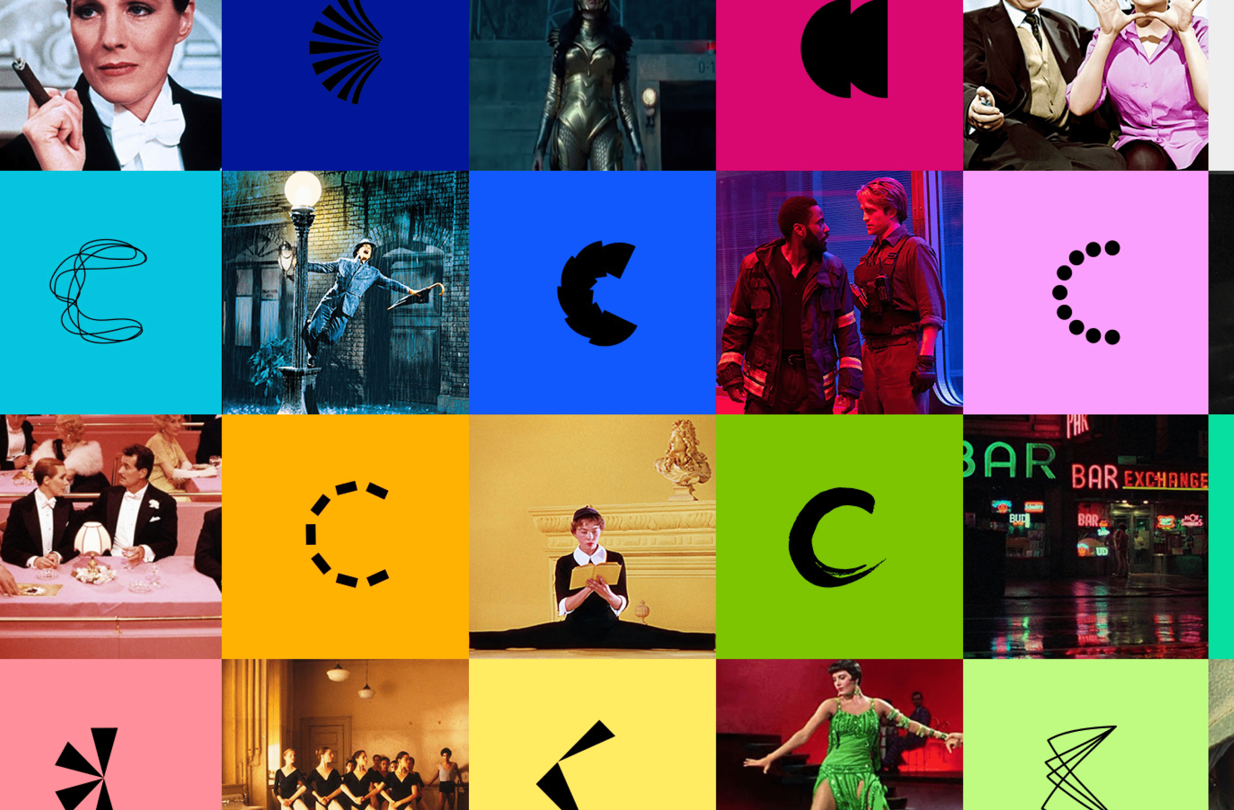
TCM’s brand refresh vibes (hi color!)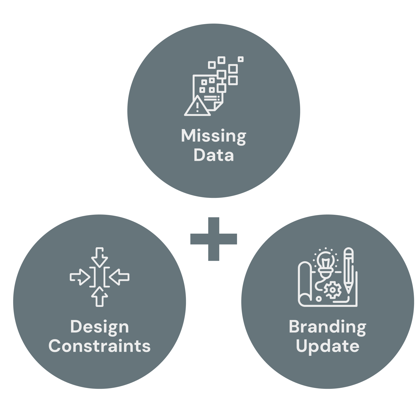
The Challenge
The project presented three intersecting challenges:
The retirement of the existing film data feed meant several pages could lose important information.
Every page element needed to be rebuilt using new platform components.
The Schedule’s interface was visually outdated and didn’t reflect TCM’s refreshed brand.
With a loyal, detail-oriented audience, the redesign had to balance usability, technical feasibility, and brand continuity — ensuring that modernization didn’t alienate fans who valued familiarity.
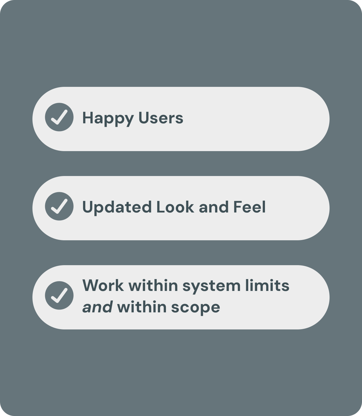
Defining Success
Success meant achieving balance across three priorities:
User Experience: Preserve the core behavior of planning and browsing films.
Brand & Visual Design: Bring the outdated Schedule interface in line with TCM’s current visual identity.
Systems & Accessibility: Work within component limits while meeting accessibility and compliance requirements.
Research & Insights
User research revealed how fans interacted with the site and what they valued most:
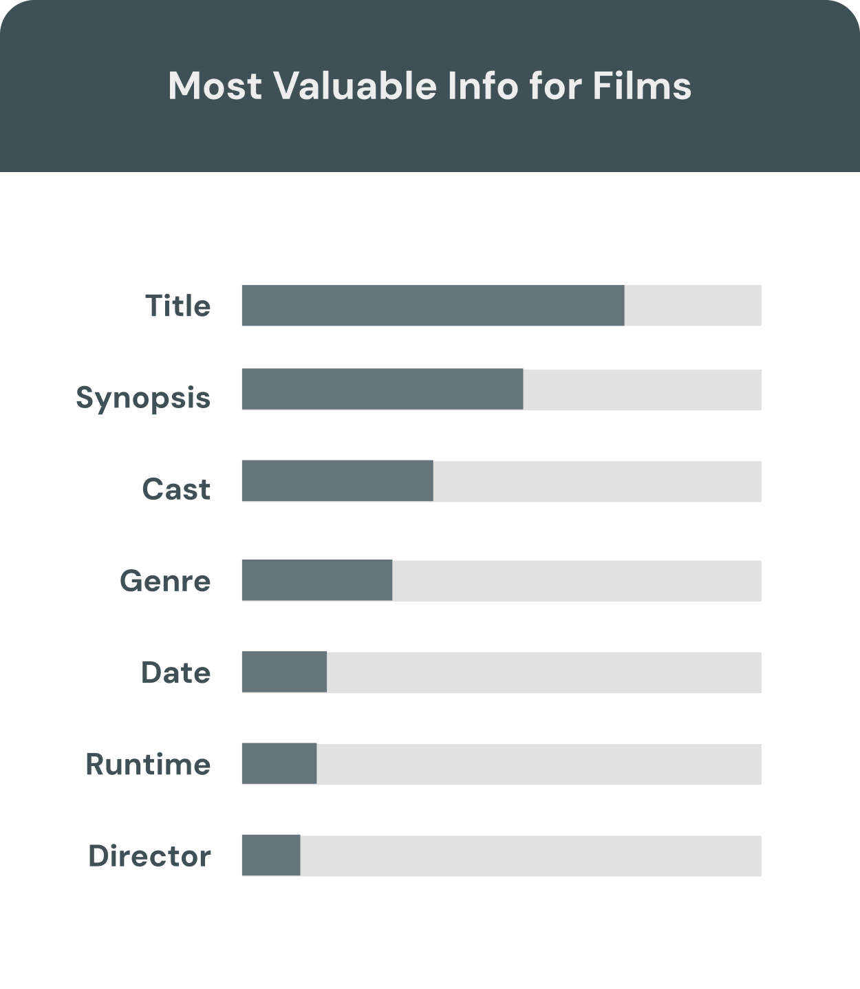
Most used the Schedule to plan upcoming viewings.
The two most important details were airtime and title.
Desktop remained the dominant platform for browsing.
These findings shaped the content hierarchy and informed the new visual design — emphasizing legibility, contrast, and clarity for a diverse, film-loving audience.
“I’ve used the schedule page many times so kind of familiarizing myself with what is available and then making scheduling plans around being able to watch certain movies. So definitely in terms of our home watching, it’s a big part of how we can figure out how, what we want to see, and and when. ”
Design Approach
To understand the opportunities and limitations of the new platform, I started by researching how other brand sites across the company were already using the design system. This helped identify which components could be leveraged and where new solutions might be needed.
I also conducted a detailed audit of the existing Schedule page to map its content structure, user tasks, and dependencies. Prototyping directly within the new system quickly revealed component gaps and guided how we could modernize the experience while staying within technical constraints.
To align design intent with implementation, I established weekly design–engineering reviews. These sessions became working touchpoints where we refined interaction patterns, resolved limitations, and ensured both usability and visual polish were achievable within scope.
Visually, I collaborated closely with TCM’s creative director to evolve the page’s aesthetic — introducing brighter, cleaner colors and refined typography that reflected the refreshed brand while maintaining the timeless feel fans associate with TCM.
Planning how to transition the original layout into a component structure for the new design systemWe identified some constraints we were going to have to keep in mind while designing for this new layout structure and make updates based on these limitations.
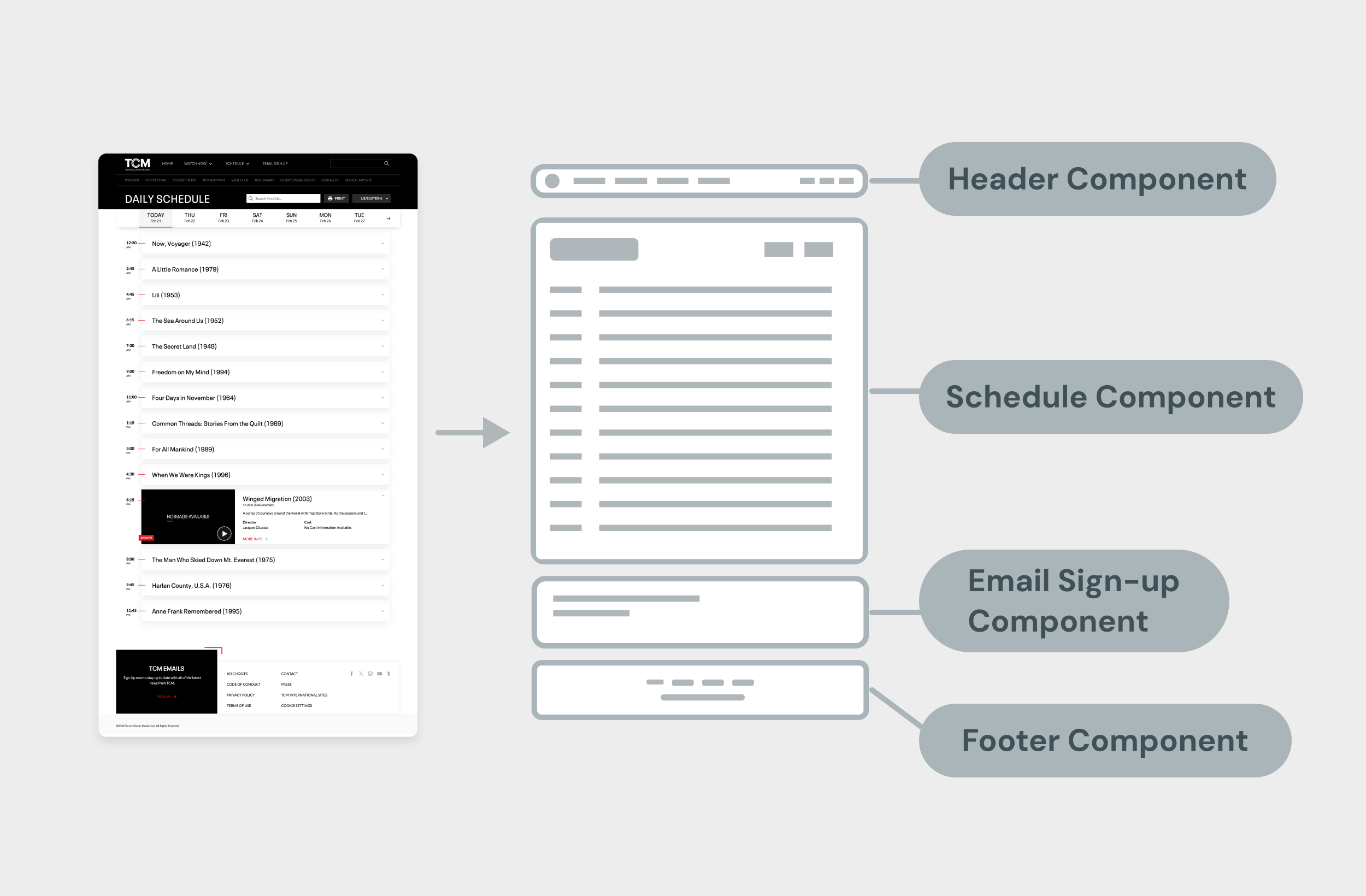
Design Approach | Schedule Component
The Schedule page was the most critical part of the redesign. It was also the most technically constrained and heavily used, making it an ideal candidate for validating the new platform’s flexibility.
Constraints:
The available system components were designed for multi-channel network grids, not the single-channel linear schedule format TCM needed.
Any new or modified component had to be reusable for other brands to justify engineering effort.
The component had to remain lightweight for performance.
No ability to print schedule out in an easy-to-read format for users.
Design Response:
Component adaptation: We analyzed the platform’s existing grid-based schedule and proposed a new single-channel variant optimized for TCM’s format. This design simplified the structure while maintaining familiar interaction patterns for users. We also knew from user research that our users enjoyed being able to print out their schedule so we asked for this new variant to include this feature.
Reusable system variant: By framing the new design as a scalable improvement, we gained engineering alignment to develop a reusable component that could support other brand needs in the future.
Data flexibility: The layout and interaction model were built to accommodate varying levels of metadata — from complete film details to minimal airtime information — ensuring the schedule remained functional even when data sources changed.
User experience focus: Research insights guided visual hierarchy, typography, and spacing to enhance scanability. Accessibility and contrast improvements ensured legibility across devices and viewing conditions.
Design Approach | Header Component
Our top navigation (header component) came with several predefined limitations from the new platform’s design system.
Constraints:
Encouraged to exist as a single row with simple dropdowns and no secondary navigation.
The search field could not remain open by default and had to be accessed via a click on the search icon.
Logo animations were not supported within the component framework.
Design Response:
Phased navigation rollout: We planned for the more advanced secondary navigation to launch later, alongside the homepage redesign. Analytics showed that sub-navigation links were rarely used from the Schedule page, so deferring this feature minimized impact while keeping the experience consistent.
Search interaction adjustment: Due to component limitations, the search required an additional click to open. The feature remained usable, and we documented this behavior as a design debt item to revisit once the component library expanded—later restoring the previous inline search interaction.
Logo animation removal: To stay within scope and prioritize functionality, we removed the logo hover animation for this release. The simplified header improved performance and kept focus on core navigation and schedule usability.
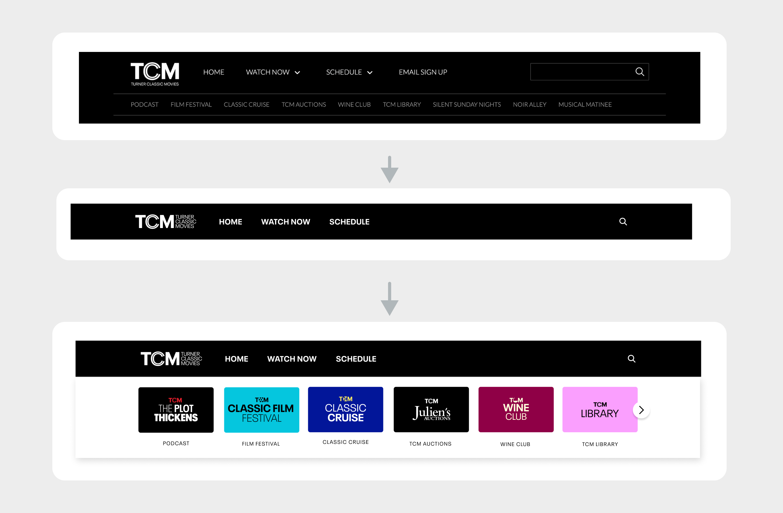
Shifting the Original header (aka nav) into the new component structure. Original to Phase 1 to phase 2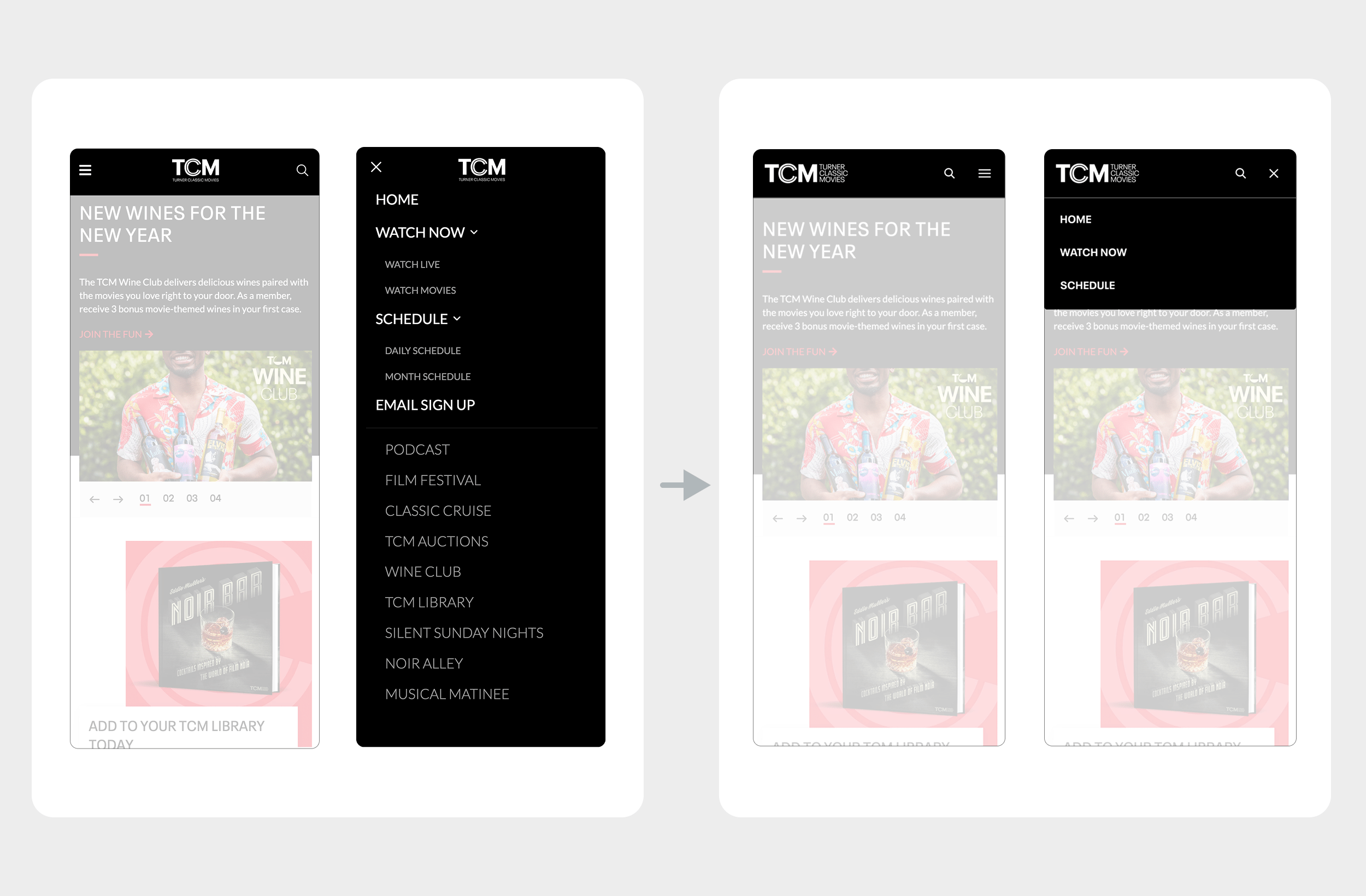
Original mobile header transitioning into new header component layoutDesign Approach | Footer Component
The new platform’s design system also imposed specific limitations on the footer component, primarily to reduce long-term maintenance complexity and engineering overhead.
Constraints:
Recommended to be only a few rows in height, with centered alignment and no column-based layout.
Complex or heavily customized footers would require manual updates across every page on the site — a significant lift for engineering and QA.
Design Response:
Simplified structure: We redesigned the footer into a single, centered row containing essential links only. This minimized layout complexity while maintaining clarity and balance in the overall visual hierarchy.
Future flexibility: Optional content, such as email sign-up and social links, was separated into independent modules that could be easily swapped or updated without disrupting the core layout.
System efficiency: By adhering to the single-row guideline, the footer remained consistent across pages and required minimal engineering effort for future site updates. This approach preserved scalability and kept the design aligned with platform standards.
Design Approach | Last Minute Addition
Late in the project, we learned that the Marketing team had been creating beautifully designed monthly PDF guides highlighting all upcoming TCM programming for the month. These were already being shared through newsletters but weren’t accessible from the site itself.
This presented an opportunity to extend value for users directly on the Schedule page. Since the existing schedule view only displayed two weeks of programming, we collaborated with engineering to identify a simple way to surface these monthly guides.
Using an existing text component, we added a link at the top for users to download the monthly schedule PDF. This low-effort enhancement gave users access to a full month of content and strengthened cross-team alignment by connecting our product experience with ongoing marketing efforts. See full page layout images below for reference!
Design Approach | Full Page Layout Views
TOp section of page on desktop and mobile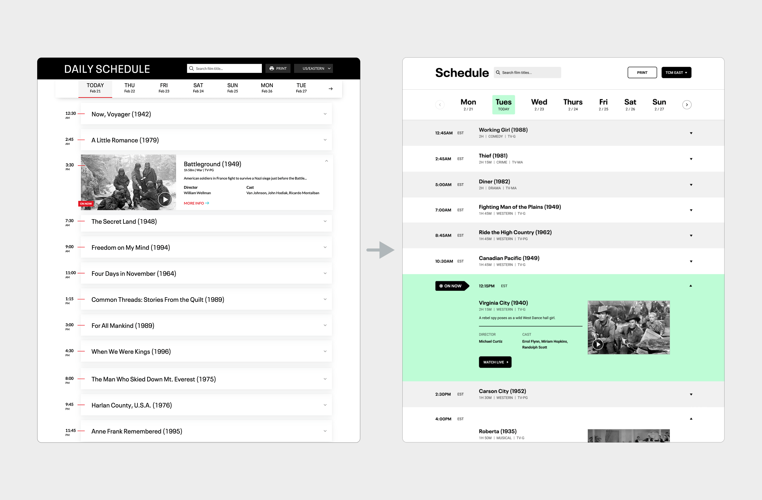
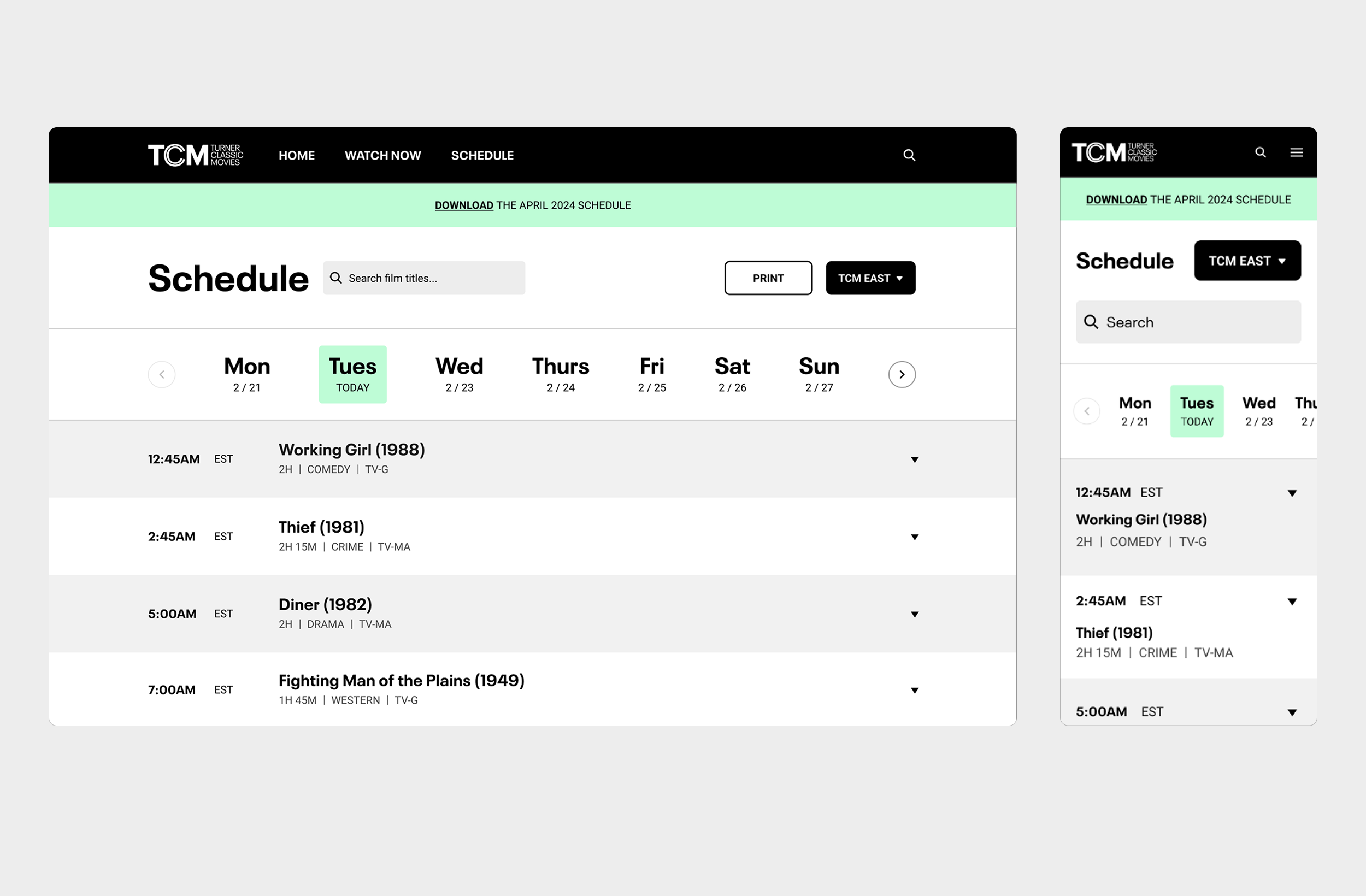
Original schedule layout on desktop shifting into the new schedule component structure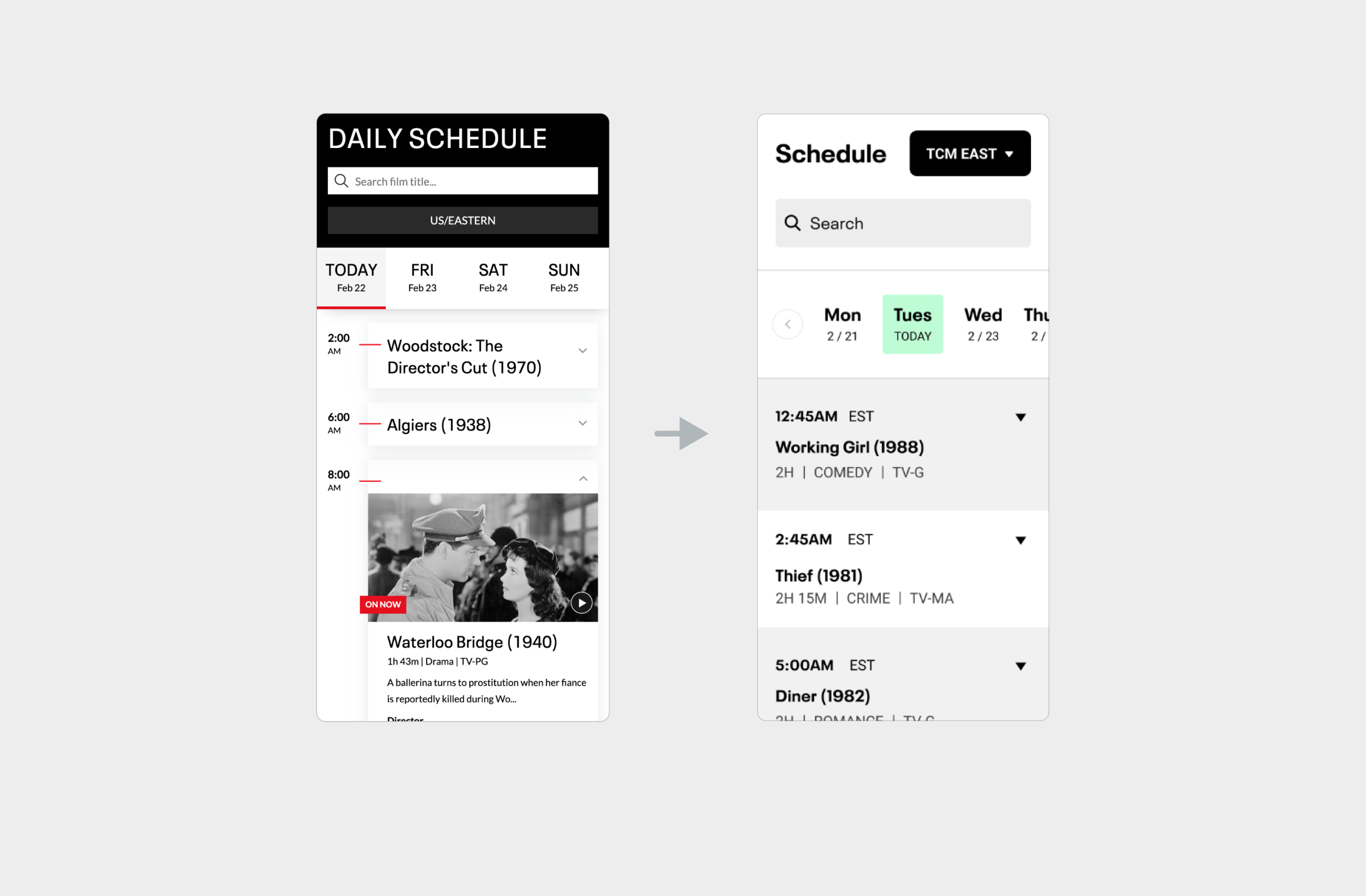
Original schedule layout on mobile shifting into the new schedule component structure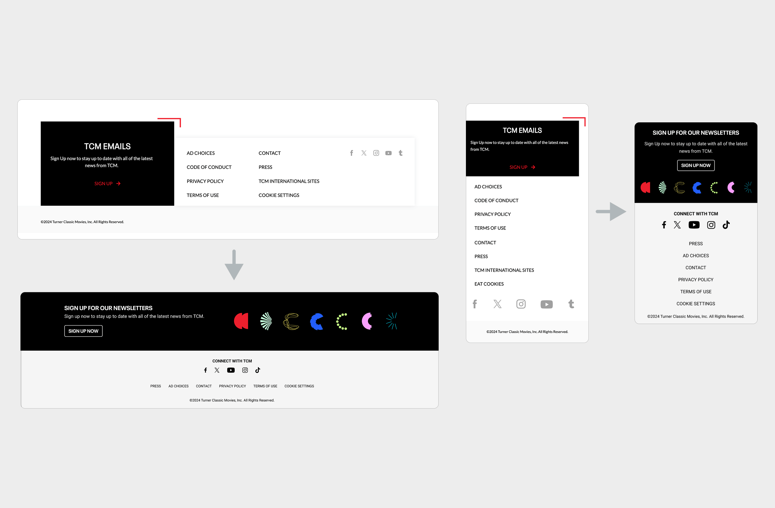
Original FOOTER LAYOUT on DEsktop and mobile shifting into the new component structure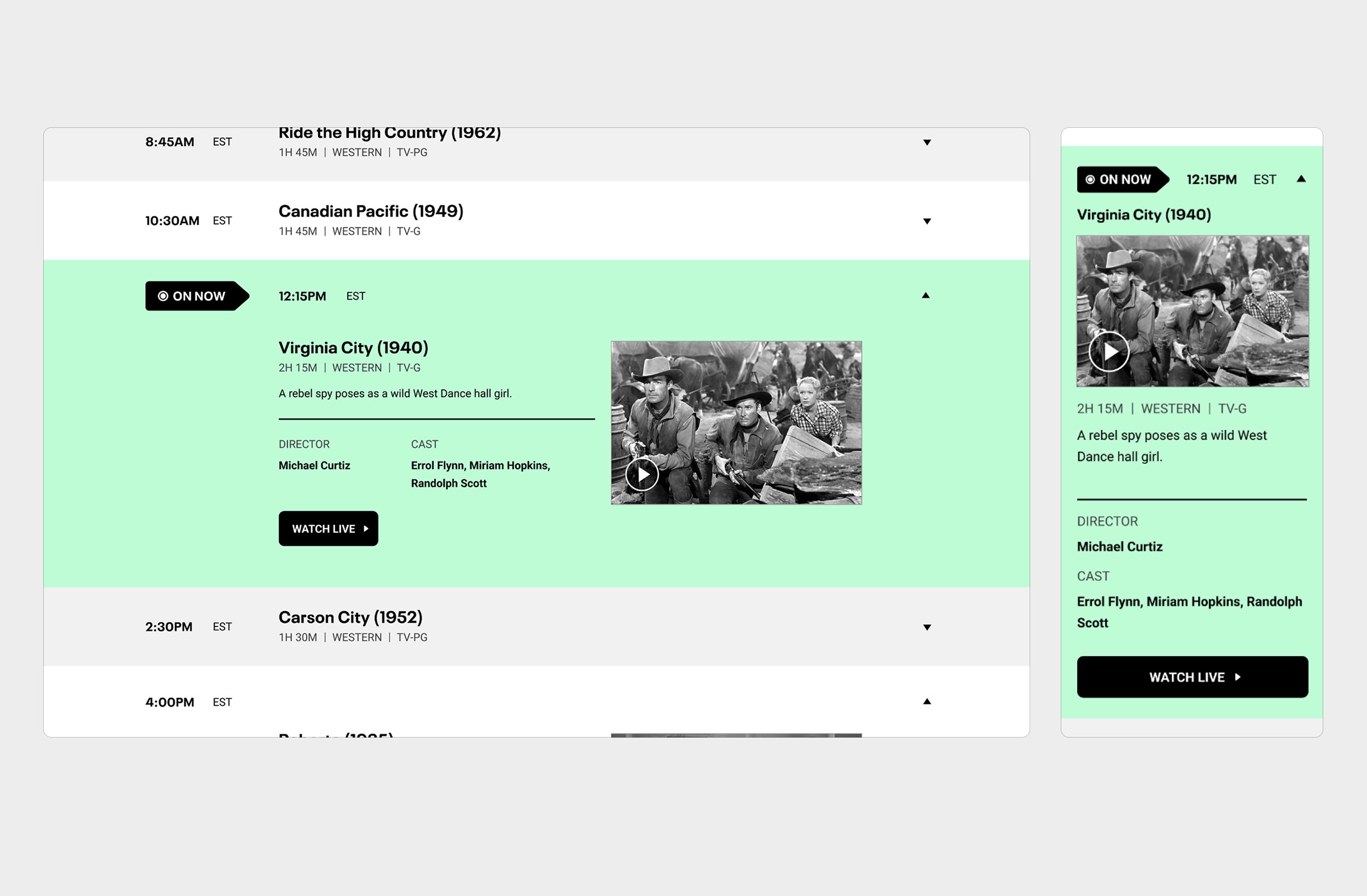
on-now section ON desktop and mobile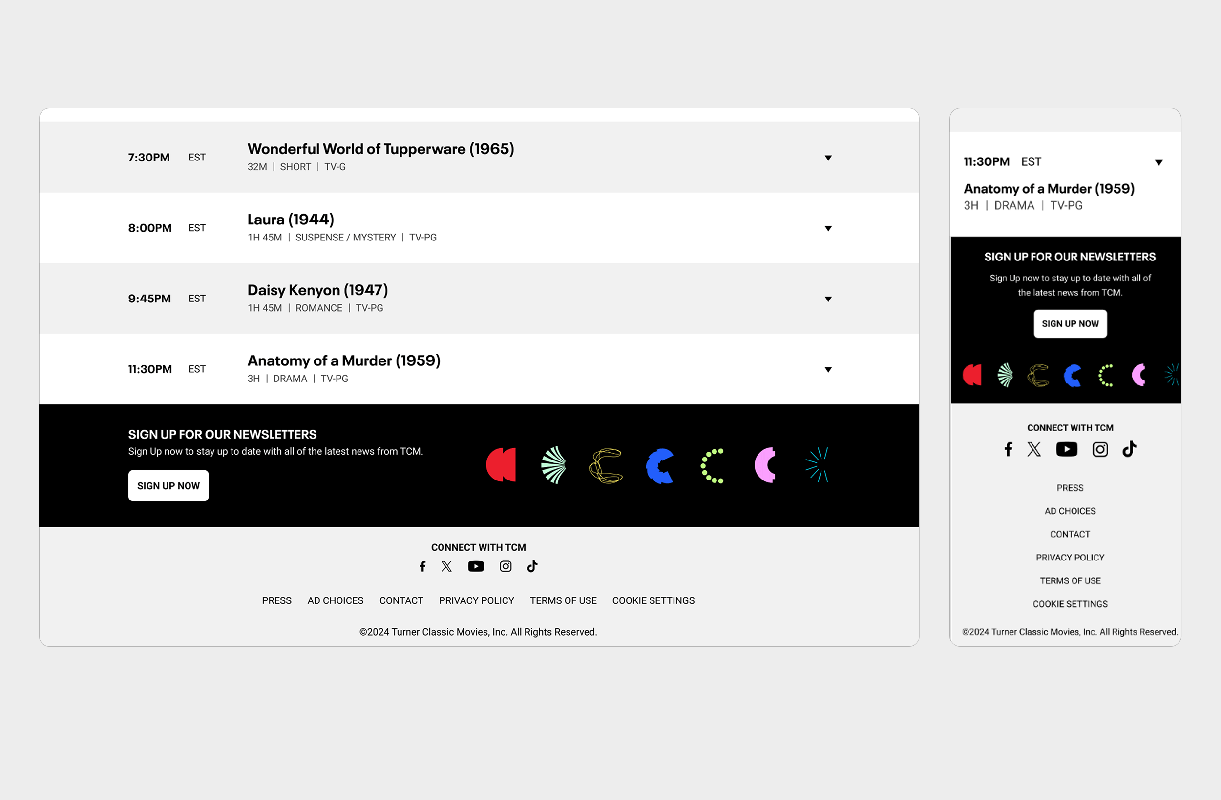
Bottom / footer section of page ON desktop and mobileOutcome & Impact
The Schedule redesign delivered measurable improvements:
Fans found the new layout easier to plan from and more visually appealing.
The updated design reduced user confusion and internal maintenance needs.
Established reusable design patterns and a review cadence for future site work.
Aligned the Schedule visually with TCM’s refreshed brand identity.
Ensured accessibility and compliance throughout.
Reflection & Learnings
This project reinforced that design can lead both strategy and aesthetics. Balancing usability, technical constraints, and brand expression required systems thinking and collaboration across teams.
Modernizing a legacy experience under such tight limitations showed that accessibility, scalability, and brand integrity can coexist when design leads with clarity.
This case study represents design exploration completed during my time at Warner Bros. Discovery.
All information shown has been adapted and generalized to protect confidential details and intellectual property.